Brand Identity
OVERVIEW
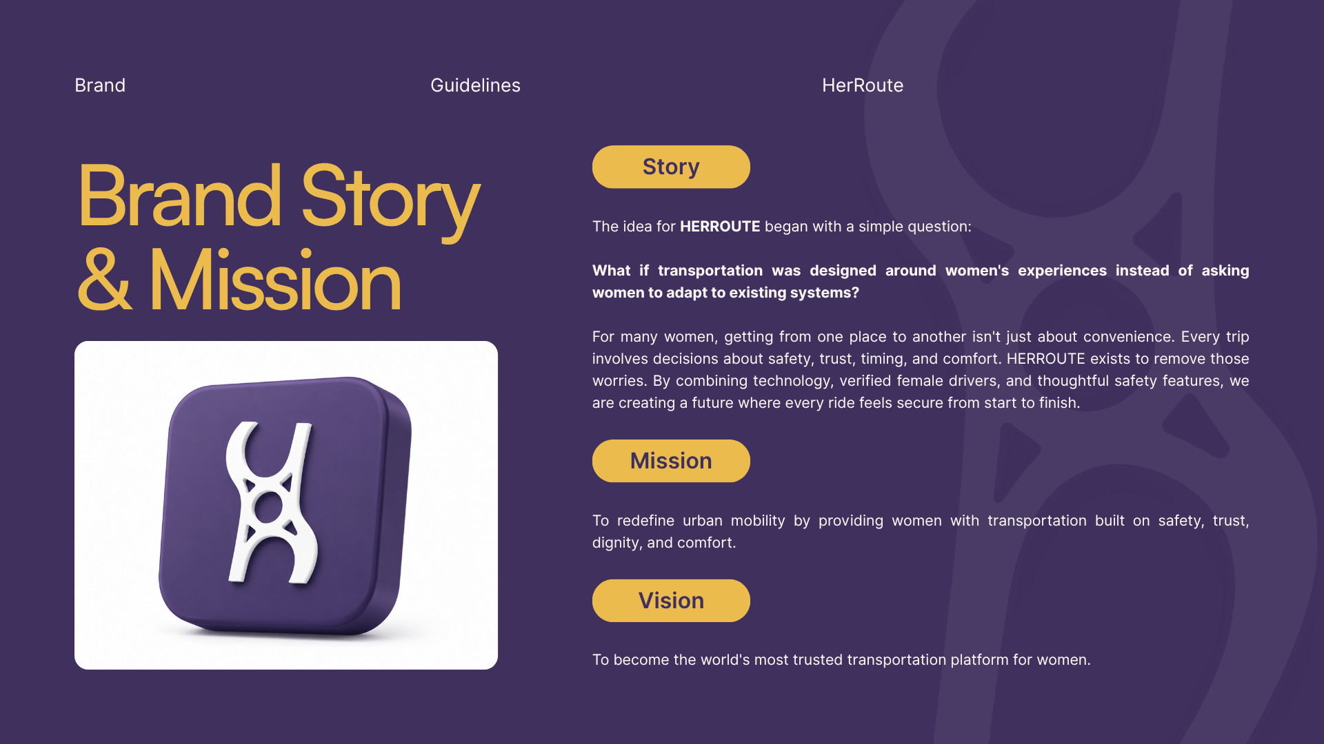
HerRoute was created around a simple but powerful idea: every woman deserves to travel with confidence. The brand connects female passengers with verified female drivers through a platform that prioritizes safety, transparency, and comfort. The challenge was to design an identity that balanced professionalism with warmth while standing apart in a crowded mobility market.
THE CHALLENGE
Most ride-hailing brands focus on speed and convenience. HerRoute needed to communicate something deeper—security, trust, and empowerment.
The identity needed to:
Build immediate trust.
Appeal to women of different age groups.
Feel premium yet approachable.
Work consistently across digital platforms, vehicles, uniforms, and marketing materials. Become instantly recognizable in public spaces.
DESIGN APPROACH
The identity was built around three core principles:
Safety
Every visual decision was made to reinforce confidence and reliability.
Empowerment
The brand celebrates women's independence by creating a visual language that feels strong without being aggressive.
CONNECTION
The platform connects women with trusted transportation, and the identity reflects community, movement, and support.
LOGO CONCEPT
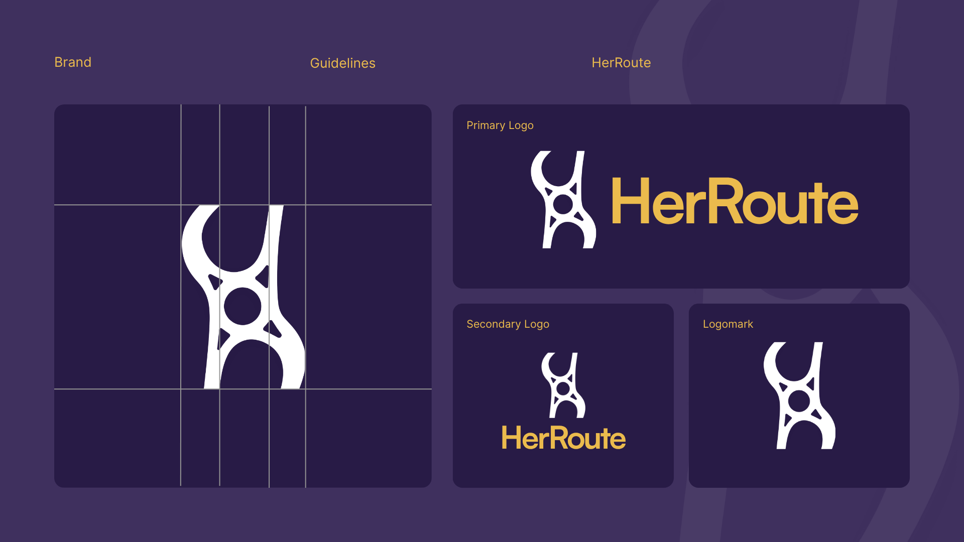
The HerRoute symbol is inspired by both the letter "H" and interconnected pathways, representing movement, connection, and safe journeys.
The circular element at its center symbolizes people and community, while the surrounding forms suggest continuous movement and protected routes.
The custom icon is flexible enough to function as:
Primary logo
App icon
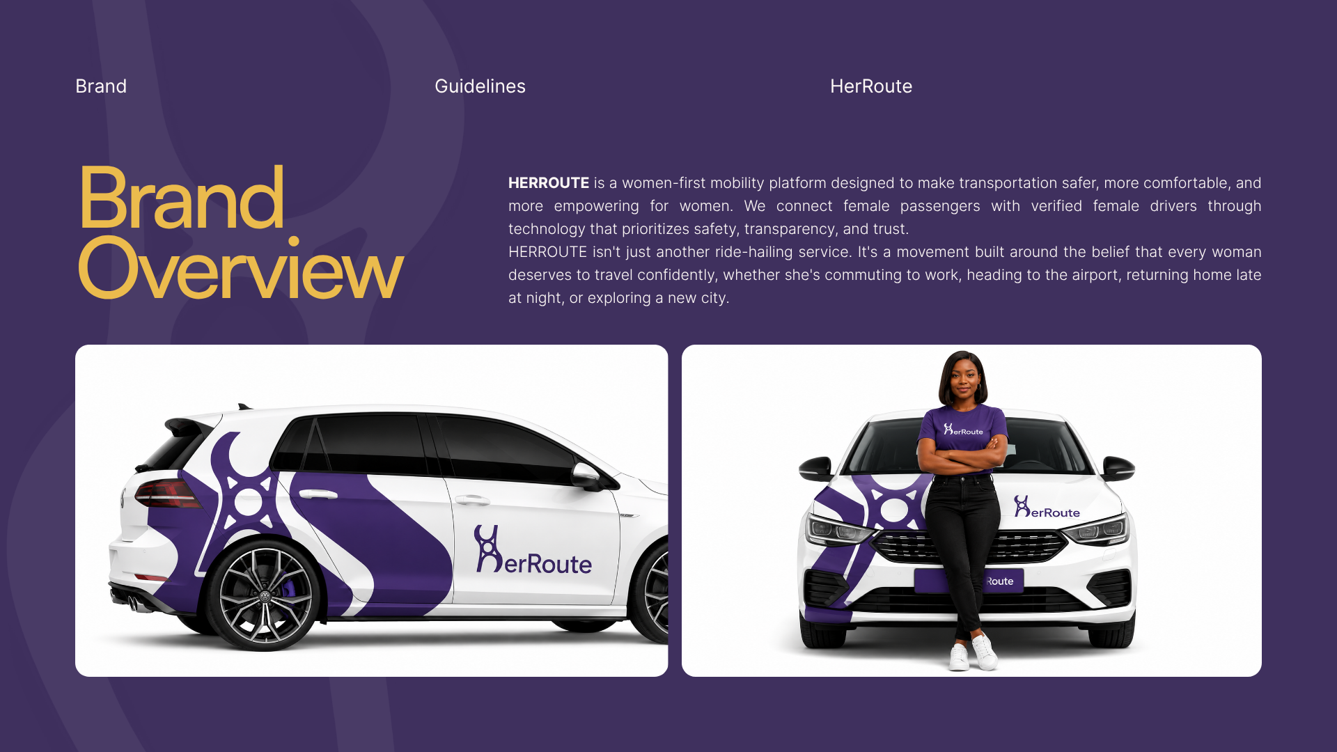
Vehicle emblem
Social media profile image
Brand pattern
VISUAL IDENTITY.
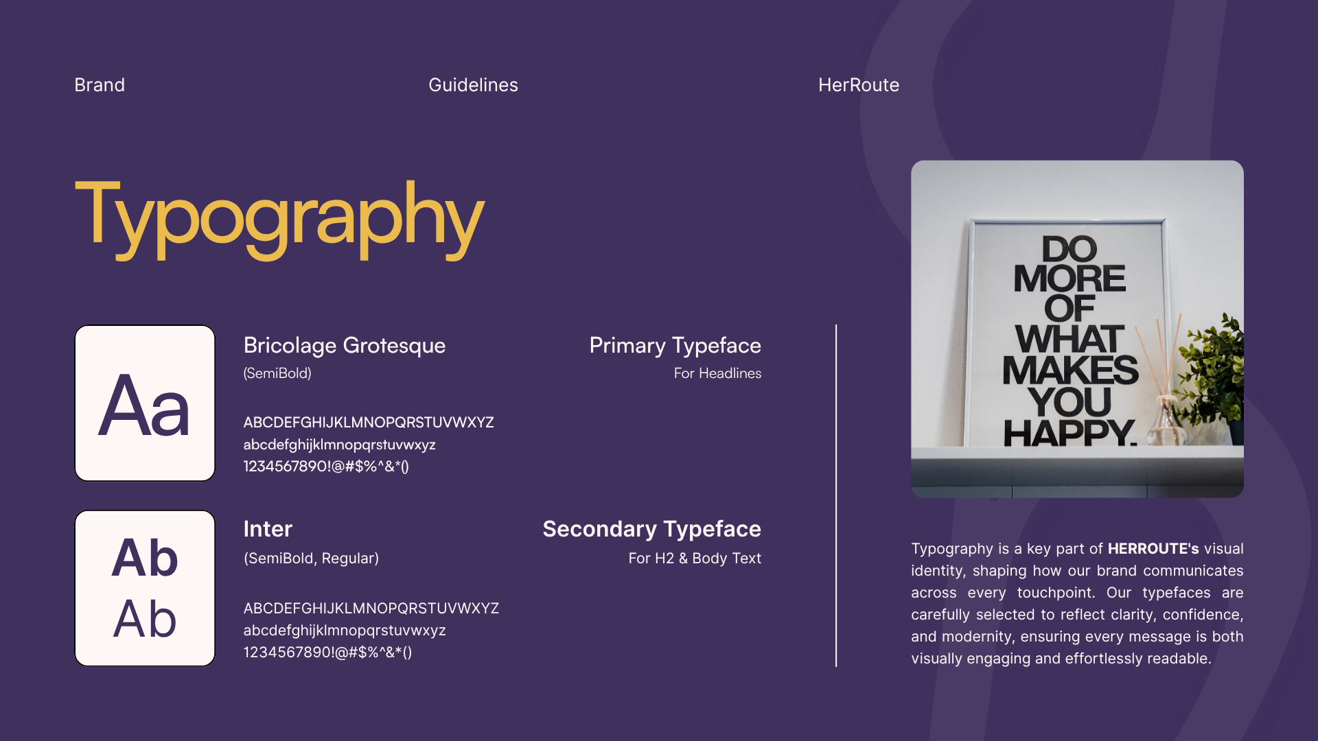
The visual system combines bold typography with a rich purple and gold palette. Purple communicates trust, confidence, dignity, and empowerment.
Gold introduces warmth, optimism, and premium quality, reinforcing the brand's mission to provide a safe and elevated transportation experience.
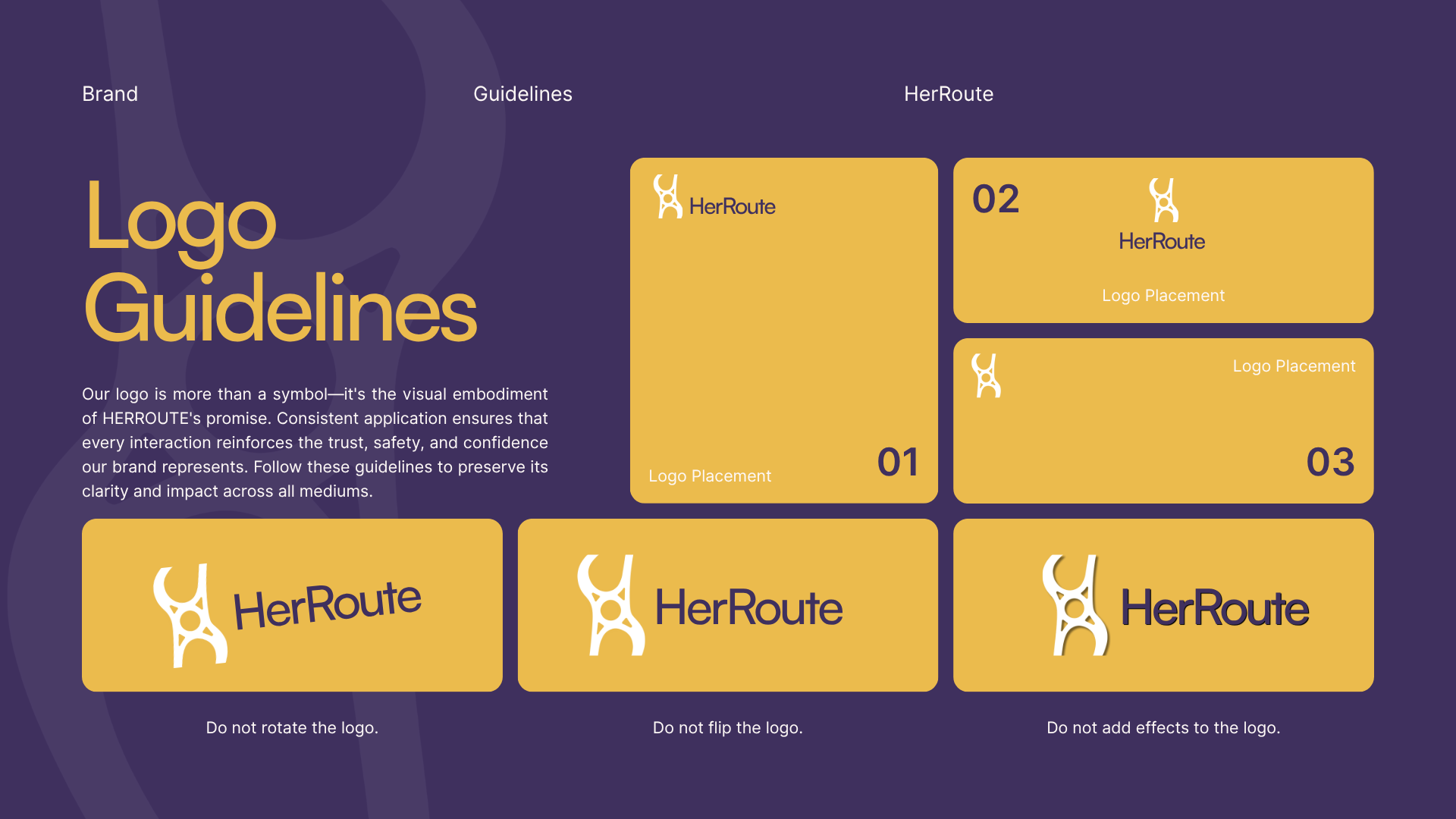
The clean layouts and consistent spacing ensure the identity remains recognizable across both digital and physical applications.
APPLICATIONS.
The branding system was designed for real-world scalability across multiple touchpoints, including:
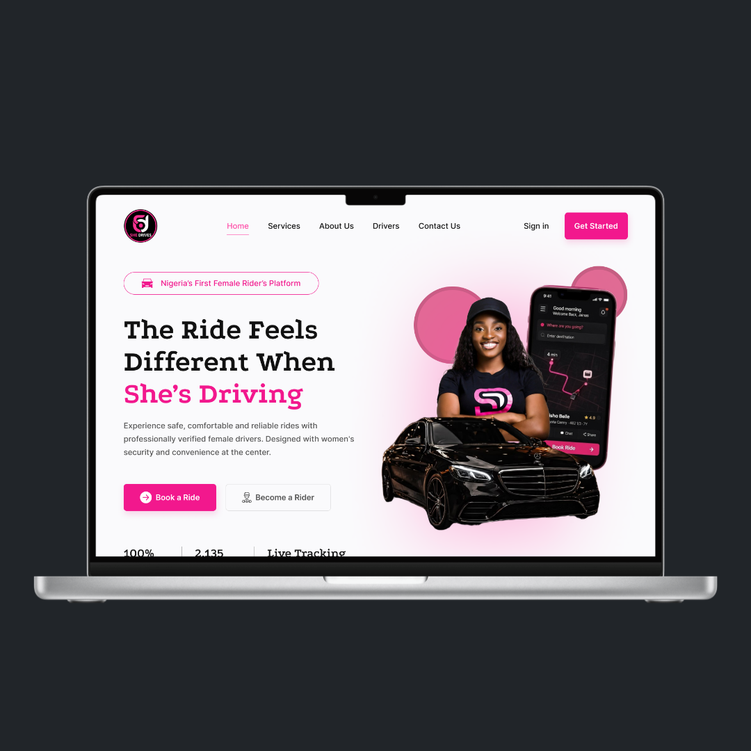
Mobile application
Website
Vehicle livery
Driver uniforms
Brand guidelines
Social media assets
Marketing campaigns
Outdoor advertising
OUTCOME.
The final identity positions HerRoute as more than a transportation platform—it establishes a movement centered on women's safety and independence.
The cohesive branding system creates a memorable experience while maintaining the flexibility needed for future growth across digital and physical environments.
This project demonstrates my ability to translate a social challenge into a meaningful brand identity. By combining strategic thinking with purposeful design, I created a visual system that not only differentiates the brand but also builds trust, communicates its mission, and supports long-term scalability.
Ready to put your brand at the centre of its market?
Tell us about your project or join the next cohort. We'll reply within 24 hours.