Brand identity — Fintech startup


Payora Fintech Brand Identity & Product Launch
Role: Brand Identity Designer Industry: Fintech Deliverables: Logo Design, Visual Identity, Payment Card Design, Social Media Campaign
OVERVIEW
Payora is a modern fintech brand designed to make digital payments seamless, secure, and accessible. The objective was to create a visual identity that communicates trust while appealing to a new generation of digitally savvy users.
The challenge was to develop a brand that could stand confidently alongside established fintech companies while remaining memorable, approachable, and scalable across multiple digital and physical touchpoints.
THE CHALLENGE
Today's fintech space is saturated with brands that often rely on similar visual styles and messaging. Payora needed an identity that would immediately inspire confidence while distinguishing itself in a competitive market.
The brand required a system that could:
Build trust at first glance. Appeal to young professionals and digital-first users. Feel modern without losing credibility. Adapt seamlessly across mobile apps, websites, payment cards, and marketing campaigns. The Design Approach
The visual identity was built around three core brand values:
Trust
Finance is built on confidence. A rich green color palette was chosen to communicate security, reliability, and long-term stability.
Growth
The brand needed to represent financial progress. Every visual element was designed to reinforce the idea of helping users move forward with their money.
Simplicity
Financial products can often feel overwhelming. The identity embraces clean layouts, bold typography, and straightforward messaging to create an experience that feels intuitive and accessible.
LOGO CONCEPT
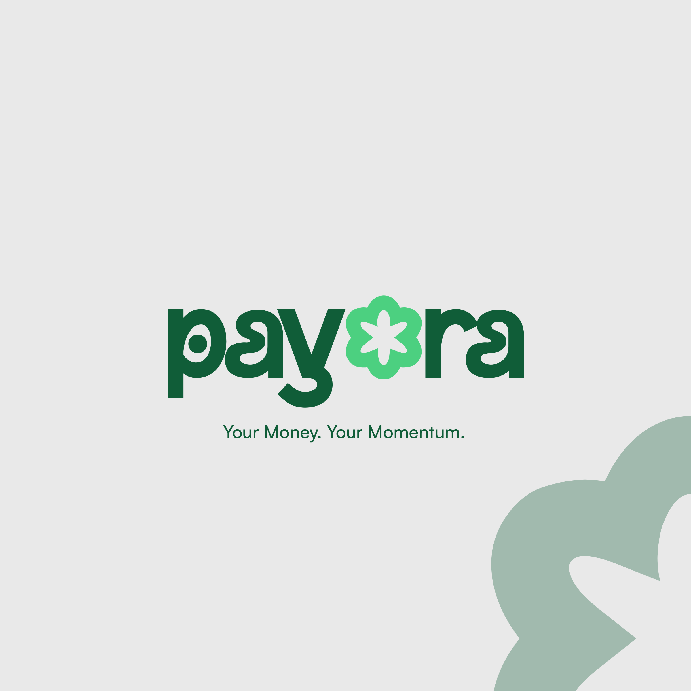
The Payora wordmark features soft, rounded typography that balances professionalism with friendliness.
At the center of the identity is a distinctive flower-inspired icon replacing the letter "o." The symbol was intentionally designed to represent multiple ideas:
Financial growth Prosperity Connection Continuous movement
Its simple geometric form also allows it to function as a standalone brand mark across digital products, app icons, and marketing materials.
VISUAL IDENTITY
The identity system uses a combination of dark and light green tones to establish a recognizable and cohesive brand presence.
Dark Green
Trust Stability Security
Light Green
Innovation Growth Accessibility
Bold typography paired with generous white space ensures clarity across both digital and print applications.
APPLICATIONS
The branding was designed to scale consistently across multiple customer touchpoints, including:
Mobile application Website Physical payment card Social media campaigns Digital advertisements Marketing materials
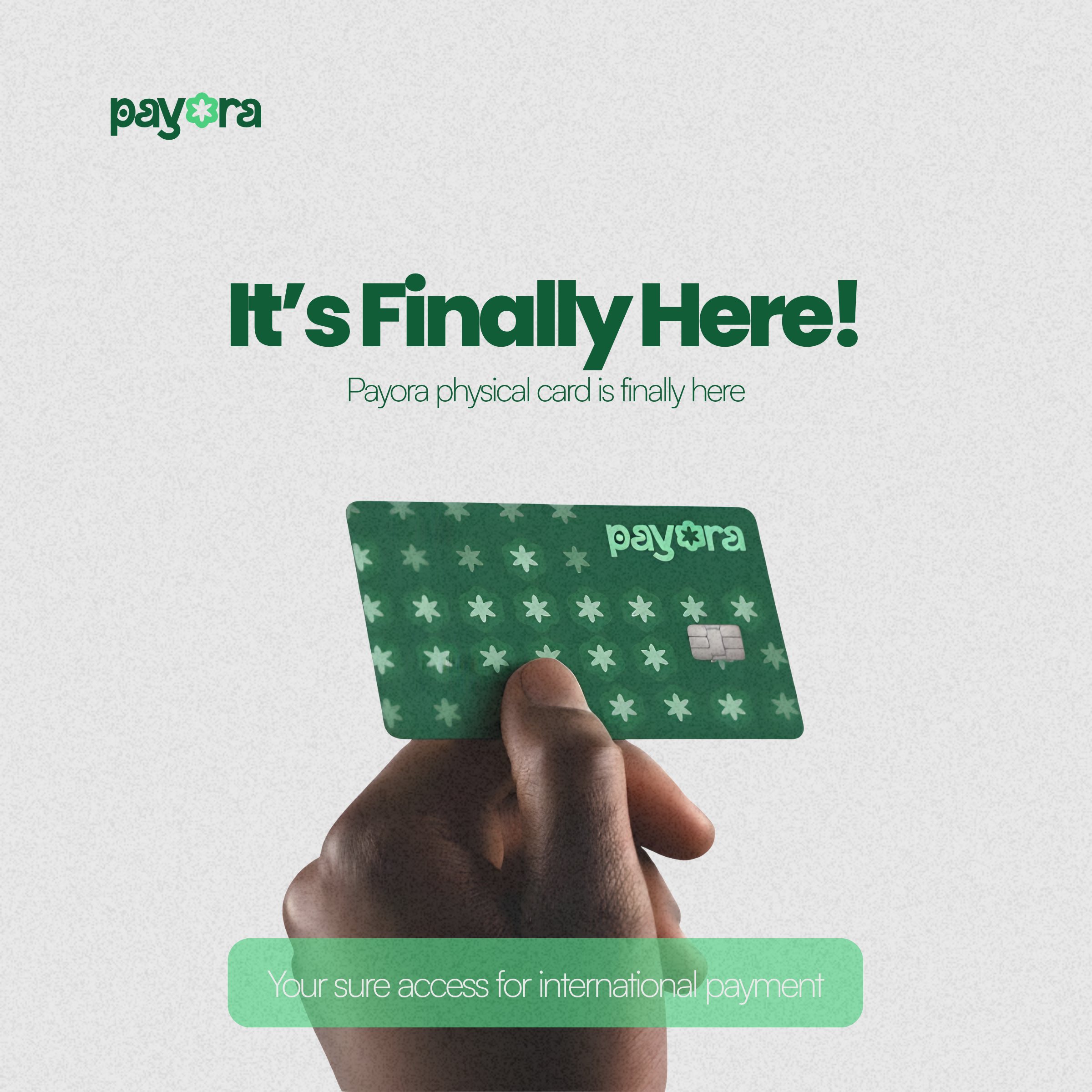
One of the featured applications is the launch campaign for the Payora physical card, introducing the product with bold typography and a clean composition that keeps the focus on the card while reinforcing the brand identity.
RESULTS
The final identity positions Payora as a fintech brand that feels modern, trustworthy, and approachable. The branding system is flexible enough to grow with the business while maintaining consistency across every customer interaction.
Through strategic use of color, typography, and symbolism, the identity successfully communicates Payora's mission of helping users move their money with confidence.
This project demonstrates my ability to transform a business idea into a complete visual identity through strategy-led design. Rather than creating only a logo, I developed a scalable brand system that solves a real business problem, builds trust, and creates a memorable experience for users.
Ready to put your brand at the centre of its market?
Tell us about your project or join the next cohort. We'll reply within 24 hours.